Manager’s Dashboard Gets a New Look: Cleaner, Smarter, and Easier to Navigate!
Updated 6 months ago /
2 min read
We’re thrilled to introduce the newly upgraded Manager’s Dashboard—part of our ongoing effort to improve user experience, functionality, and data visibility across the platform.
This UI/UX redesign brings significant improvements aimed at making your workflow more intuitive, efficient, and visually streamlined.
What’s New in the Manager’s Dashboard?
Here’s what you can expect from the latest update:
- Collapsible Left-Side Menu
Easily collapse the sidebar for a cleaner interface and more workspace—especially helpful when analyzing data.
- Advanced Button for Custom Views
Quickly toggle filters, charts, and graphs to tailor the dashboard to your specific needs.
- Improved Dropdown Filters & Button Placements
Optimized layout helps you access tools faster and keeps everything you need right where you expect it.
- Minimalist Tile Design
Each tile displays clear, focused data using modern icons, improved fonts, and better contrast for readability.
- Full-Width Grid Layout
With the advanced section hidden, tiles stretch across the screen to maximize data visibility.
- Cohesive Color Scheme and Font Styles
A modern, eye-friendly design that improves both aesthetic appeal and ease of use.
- Simplified Labels & Enhanced Tooltips
Labels have been refined for better clarity and less clutter, while tooltips have been enhanced to provide more helpful and accurate descriptions of each feature.
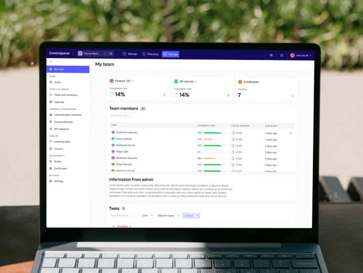
Take a Look!
Here's a glimpse of the new Manager’s Dashboard interface in action:
Why It Matters
These changes are more than just visual:
- Faster Navigation - Access what you need without extra clicks.
- Better Data Clarity - Read and analyze reports more effectively.
- Enhanced User Experience - A layout that adjust to your workflow.
When Will You See the New Look?
This has been rolled out to all customers